Our objective was to connect tutors and students and give them the best class experience through a mobile app. Students should have a simple way to find tutors and a great mobile classroom, where tutors were able to explain any high-school subjects.
Category
Education / Marketplace
Role: Product Designer
Focused on the information architecture, user flow, wireframes, prototypes and UI. Working with PM and UX Research professionals.
Problem
We've talked with twelve private teachers and almost twenty students that often solve their high-school doubts through online private lessons. Our major objective was to understand current problems about 1:1 mobile education platforms and get some insights.
Students have reported that often they have a hard time finding private teachers online and that most of the 1:1 apps are focused only on language learning. To find private tutors to teach high-school subjects, they'd usually try to get a friend's recommendation.
We've also identified that they prefer to use basic conversation apps like iMessage, Skype, Telegram or Whatsapp. Students and teachers usually send exercise photos and some voice messages to report their doubts or to explain the exercise resolution.
Many students use basic conversation apps to solve doubts with their tutors
Most of students are trying to learn by using a smartphone
They can’t find a great 1:1 education platform app for Android or iOS
Students have difficult to find private teachers
Objective
Our objective was to create a mobile app where students would be able to find tutors and schedule lessons easily. Following this path, our second biggest challenge would be to create an easy flow where a student can contact his tutor quickly and design a digital classroom where it would be easy to learn, explain, share images and anything related to the subject that the student is trying to learn with his tutor.
User flow
Our user flow is divided into two parts: First-time user experience (FTUE) and the complete experience. I'm sharing the FTUE below (light blue color) to show what is available to the users when they're not logged.

After the user sign-up, he can explore the complete app, send messages, mark a tutor as a favorite and join a classroom. This flow-chart was the base for design our first wireframe and start to explore solutions for students.
Wireframe
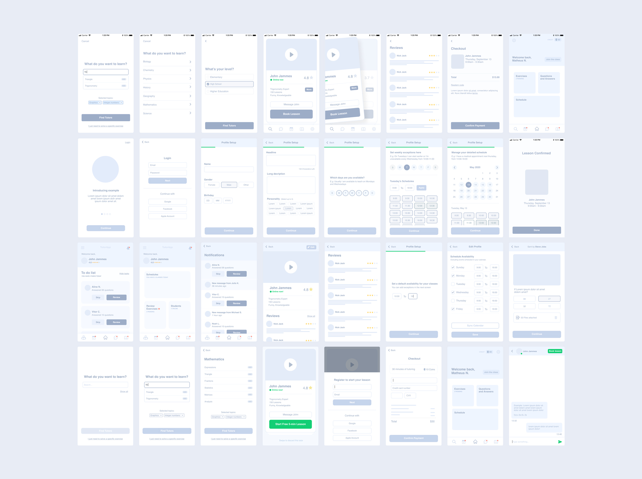
I've made our first screens as a medium-fidelity wireframe. It was very important to design faster and preview different screen possibilities. I believe that medium-fidelity is the best way to create wireframes because it might be used to create a fast prototype and get some insights from user interviews. They can also give a clear vision to product managers of what I'm thinking to design.
Our main objectives were:
Users need to be able to select what they want to learn
Users need to understand that we're showing the best tutor for him
When the user is scheduling a lesson, the calendar needs to show the most dates possible
Users need to join a classroom without difficulties


Conclusion
After validating our prototype with users, I've started to create the user interface. All screens were designed following interview results and important feedbacks over our medium-fidelity prototype, always getting product manager's suggestions and approvals.
User Interface Design
My proposal was to design a clean and functional interface for all kind of users. Where students or their parents could use without difficulties. So, following the flow-chart and wireframes that you've seen before, these are some finals screens that I've designed:
Search Results
The major objective is to make the student understands that the recommended tutor is the best result for him. So, we've added a description on the tutor card and gave to him a special place on the screen. Show the lesson price might be a reason to students don't access the recommended tutor profile. So, we hide this information on the first card.
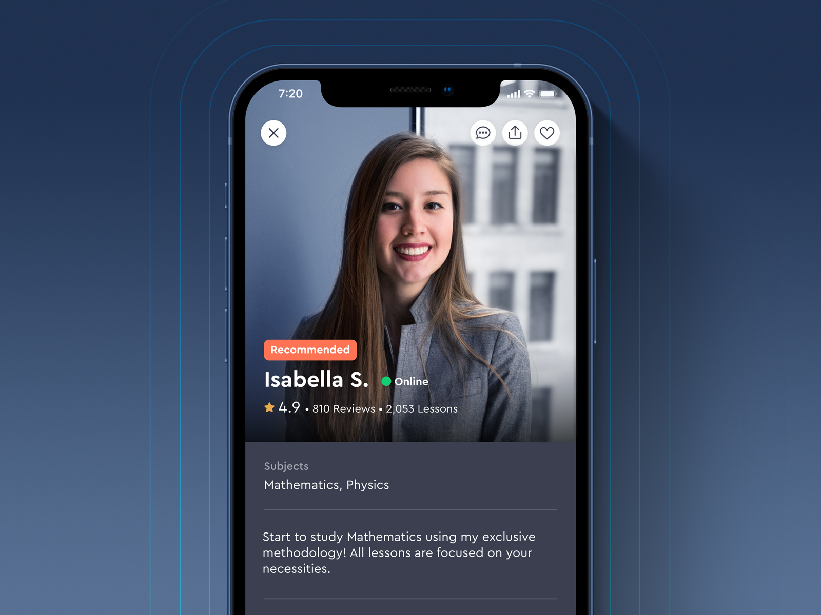
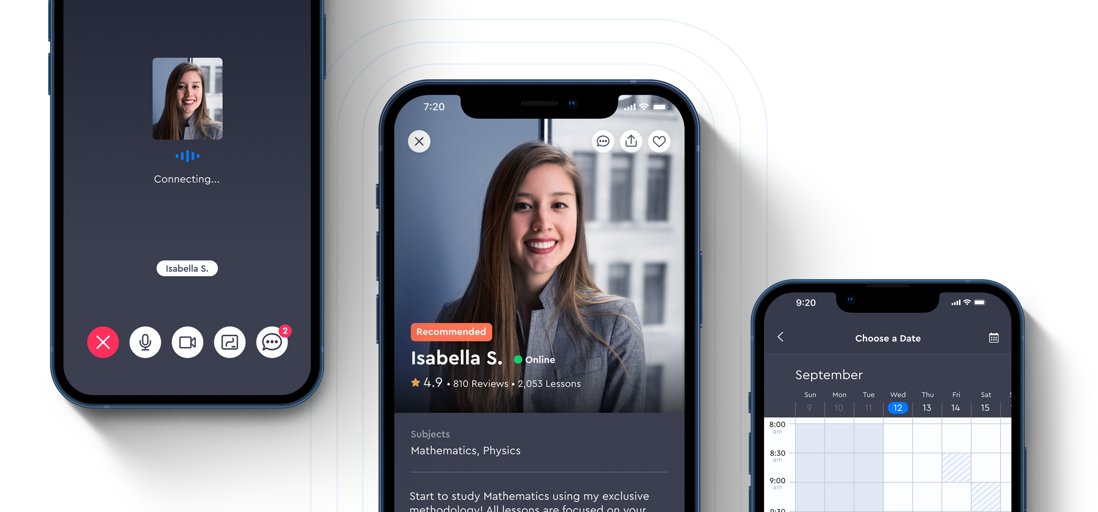
Tutor Profile
This is the screen where users need to be able to contact the tutor trough messages, read comments, reviews and schedule a lesson. I've designed a screen where the user could feel that he's seeing a "premium" tutor. I've made the "book a lesson" button always visible on the bottom.
Calendar
To improve the user experience we would like to show the most dates and hours as possible, where users could see available hours of a whole week on a single screen. We've solved it by introducing a fully scrollable weekly calendar where users can see available hours and dates easily.
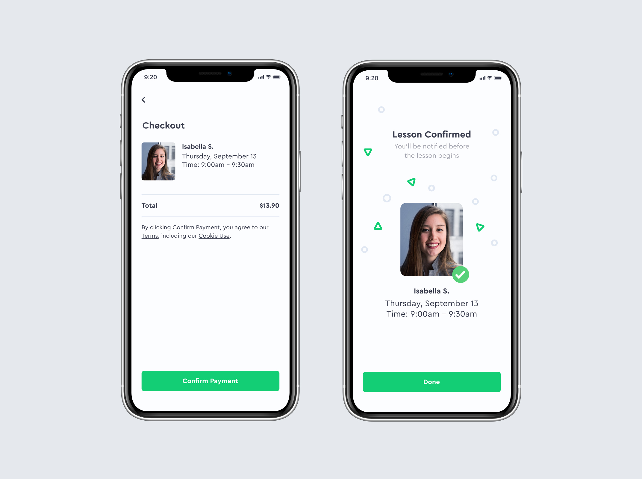
Payment
In this version we're using the Apple Payment Method, so we don't need to work with credit card fields and things like that. I've designed our checkout using basic information.
Home screen
I designed a screen for cases when a student hasn't any contact with a tutor. In these cases, we show this search screen. A connection between a student and a tutor is identified if the student established contact with the tutor through messages, booked a lesson or if the student set the tutor as a favorite. So we show the tutor card on the home screen. If the app identifies that you have more connections, these cards are set as slides.
Favorite Tutors
All tutors that you've marked as a favorite or sent a message, will be available on your favorite tutors. You can check their messages, go to their profile and schedule screen.

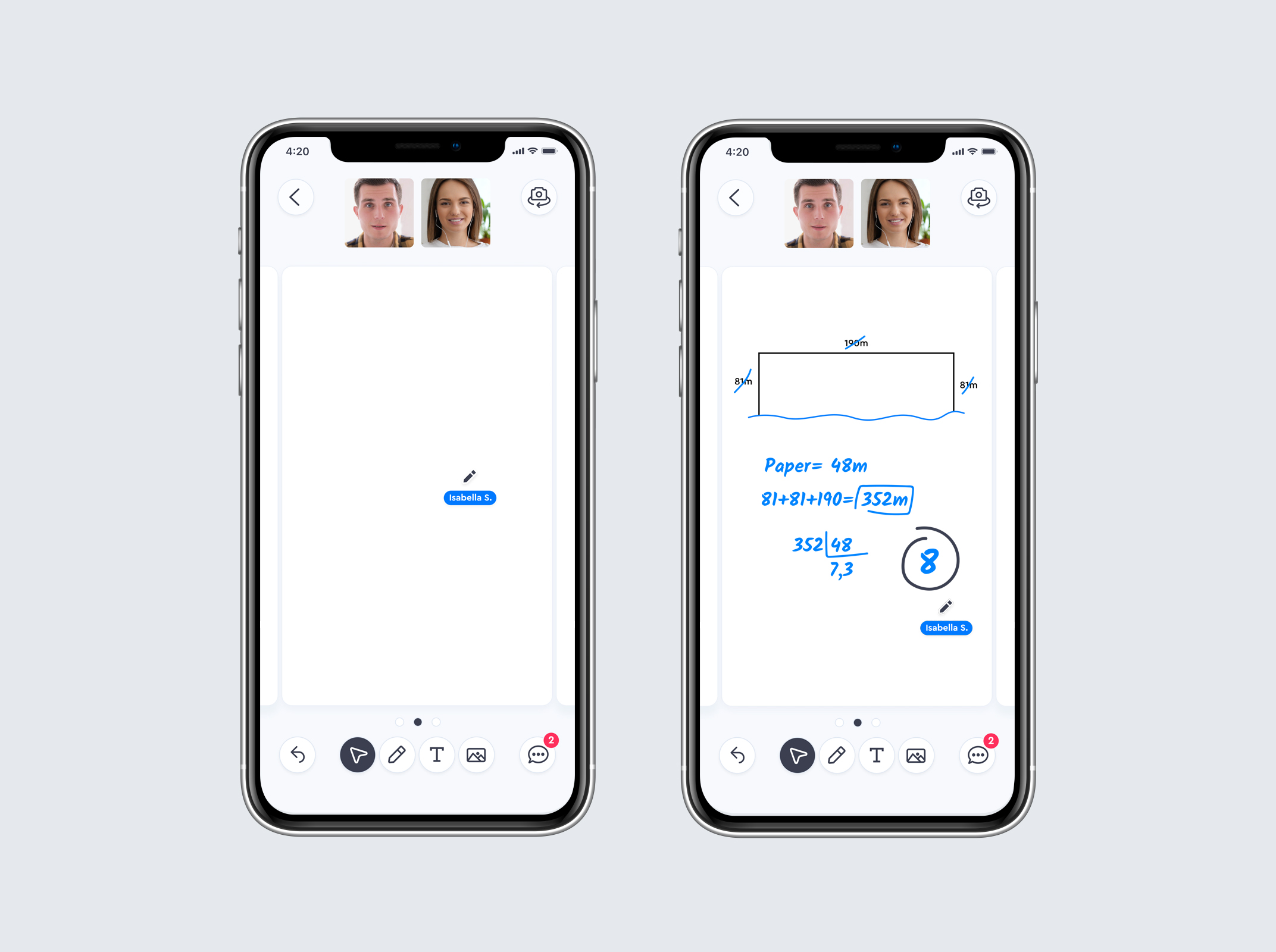
Lesson experience
For the lesson experience, I've designed a room where the student can join and connect with his tutor. They can see each other through video and audio.
Joining classroom
Users get some notifications before the lesson begins. They can access the digital classroom through push notifications or by home screen and my schedules screen. If the user is using the app when the lesson begins, a popup will appear over any screen to notify.
Whiteboard
I've designed a whiteboard for students with basic functionalities like Pen, Text, Function (Math) and Image upload, where users can share anything related to the subject that they're trying to learn.
Icon Library
I've designed dozens of icons for this project, following the same design pattern to apply in each session that was needed.
Final considerations
This project is in the alpha stage and it's already available on the App Store in some countries. The team is collecting results and doing some A/B tests to validate or identify other opportunities.
That's it.
Thank you for your time,
Vitor Canuto