This project is a module inside the CitiBank App (BR) where users might see multiple credit cards and navigate between them to check receipt and the card options. The main objective was to create a micro-interaction to navigate between cards and have a clear design for primary actions, like payment and details.
Category
Bank / Finances
Type
User Interface Design and Micro Interactions
My Role
I've worked completely focused on user interface, where my proposal was to create simple navigation to see the card receipt and options like purchase history, benefits, payment and others. I created a prototype to be a guide for the developers. They were able to navigate and see the micro-interaction to implement.
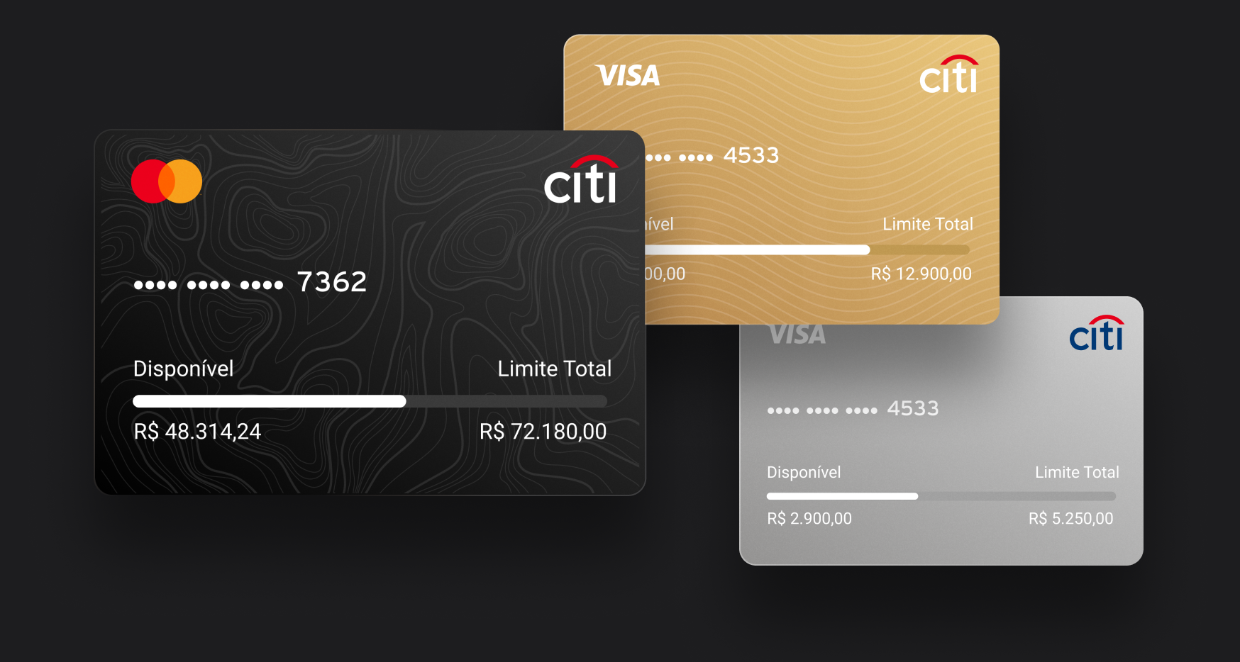
Card Model
There are many layouts for credit cards at CitiBank, but all of them have the same information to display to the users: How much was used, the limit available and the operator (Visa, Master, Amex). I designed an layout where is possible to check this primary information.
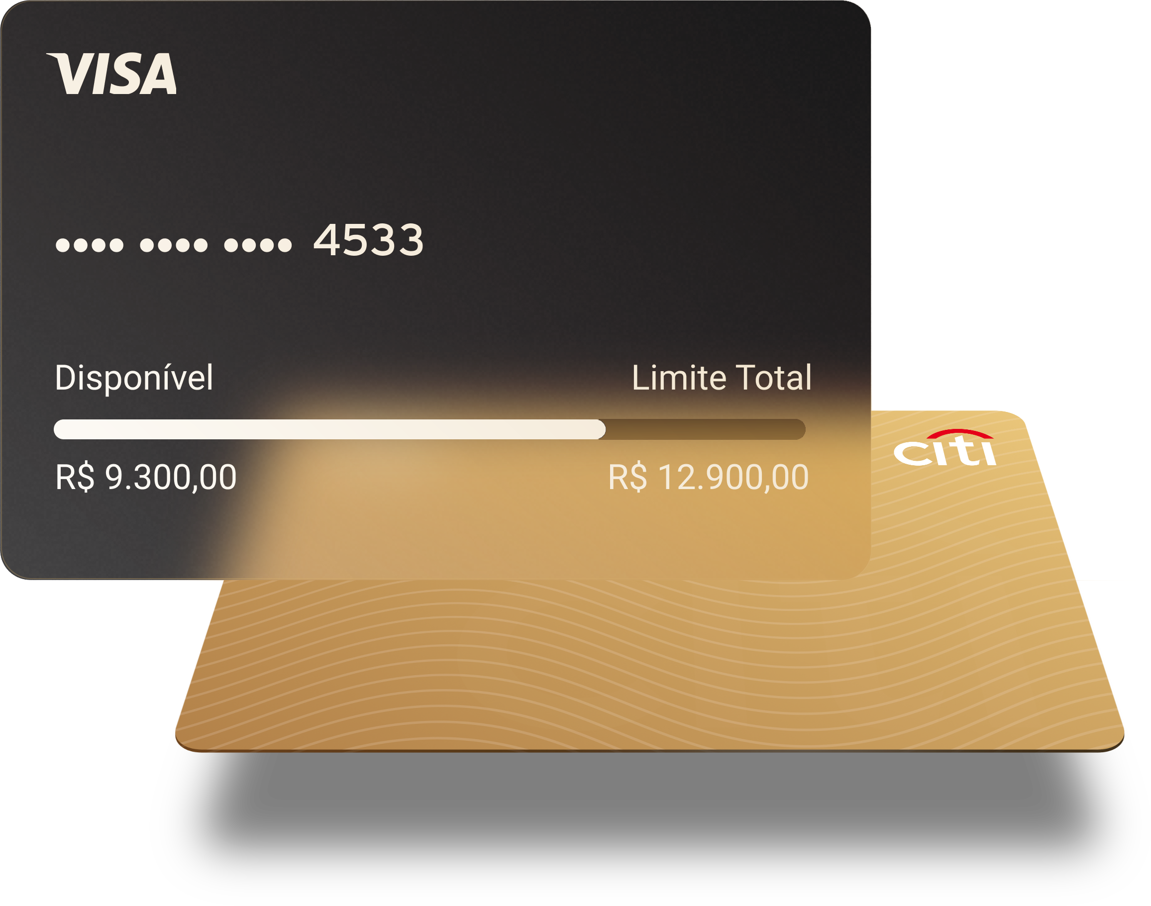
I created these models to represent basic, gold and premium cards. They're applied when a personalized card layout isn't available:


Displaying User's Cards
I decided to create a vertical scroll to show user's card. They might see primary informations before select a card, and when the user clicks to see more details about a card, I created a micro-interaction where it shows the selected card in front of the others. In this feature, users need to be able to:
See all active cards and available options
See primary informations before select a card
Navigate between differents cards

Micro-interation
I designed this micro-interaction where users can select a card and see their others cards behind the first one. We show at most 2 cards - even if the user has more cards. Users are able to swipe the card to return their default view or just click at the close button, as you can see bellow:
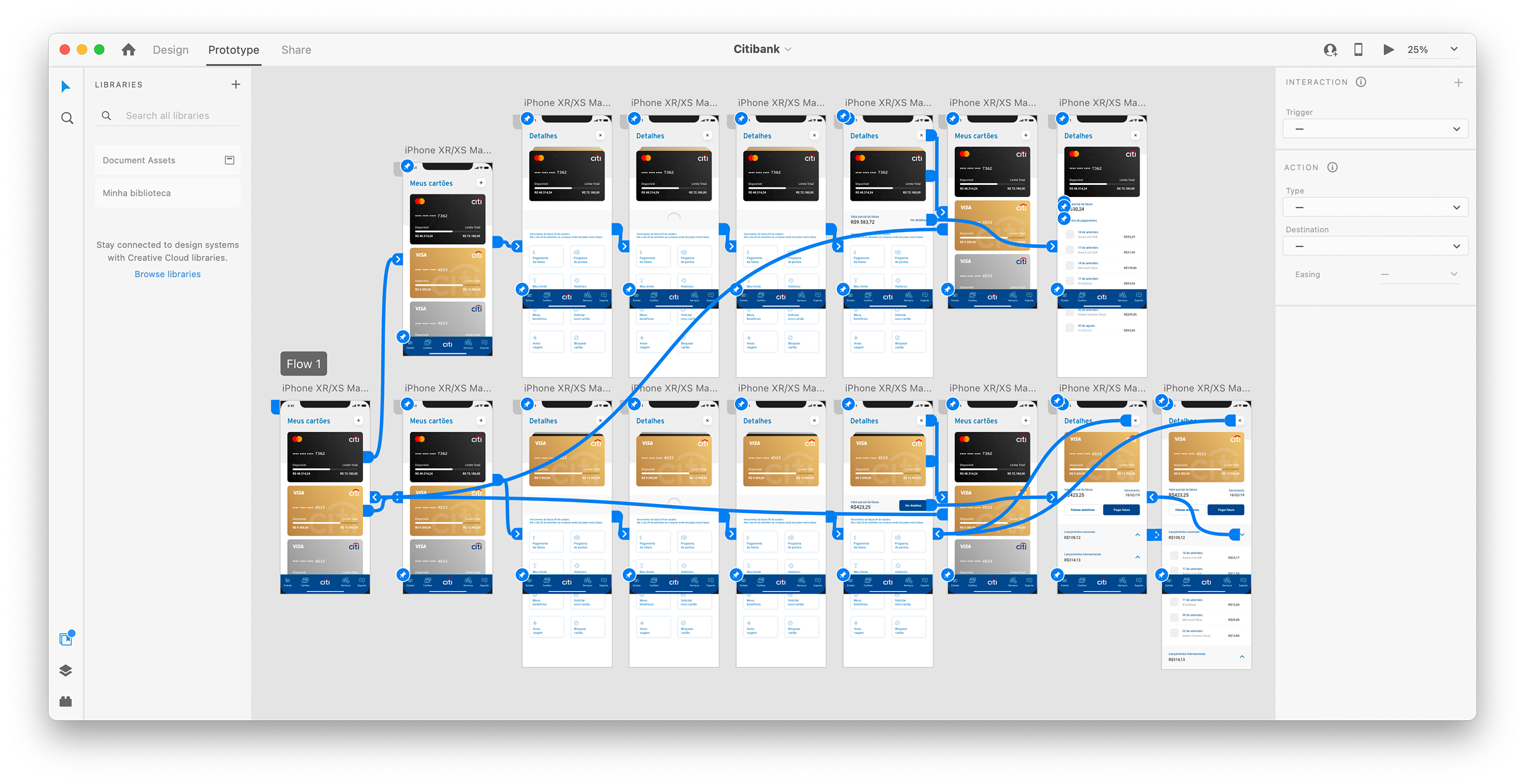
This prototype was created using Adobe XD. Developers got the access to see the result and to compare this animation style during the development.
Card details
When the user access the card detail, he might see options available for his card, request a new limit, communicate if the card wast lost and other things. In this options screen, I designed a way to show the card month amount and the limit date for the payment. These are primary informations when users is seeing the details screen.
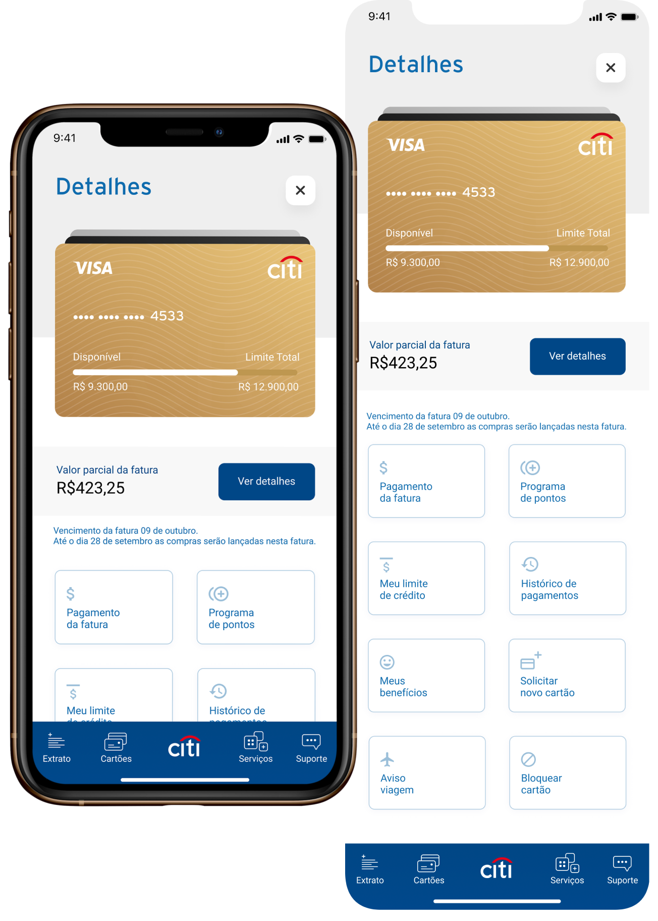
Receipt Screen
After user access the card detail and click to check the receipt details, I designed this screen where we've all purchase informations and payment options. Users can return for the previous screen easily using the top buttons or sliding the screen from de edge.

Prototype
A prototype was created using Adobe XD to validate with users by UX Design team. This prototype works perfectly on iPhone X screen size and was runned by XD for mobile.